4. Statistical Tests II – Regression
Statistical modelling and its uses in palaeontology
In simple terms a statistical model is an estimation of the relationship between one dependent variable and one or more independent variables. Specifically, in the cases of the models I will discuss in this and the following few articles, a statistical model asks how much of the variation in the dependent variable is explained by the variation in the independent variable(s). For example, on a standard bivariate graph the dependent variable is placed on the y-axis and the independent variable on the x-axis. I should just briefly mention that there are a number of synonyms for the dependent and independent variables (Table 1) and while they do have subtle differences and specific uses you may see them used interchangeably in the literature.
| independent (x-axis) | dependent (y-axis) |
|---|---|
| predictor | response |
| regressor | regressand |
| controlled | measured |
| manipulated | responding |
| explanatory | explained |
| input | output |
In the previous article I discussed how to correlate two variables, and while from the description above it could be confused with a regression – specifically a linear regression – there are some similarities that I should just briefly discuss. Firstly, they are similar in that they both provide a correlation coefficient, i.e. a measure of correlation between two variables. Also, neither provides an answer to whether there is causality between the variables, in that you still don’t know whether changes in one variable cause changes in the other, merely that they are related. However, they differ in that a regression provides more information that just a correlation coefficient; specifically, using the equation of the line of best fit we can infer values for the dependent variable based on values for the independent variable. Typically though when researchers are illustrating the results of such an analysis they will include on the scatter plot both a line of best fit (regression line) along with a measure of correlation (typically a combination of R2 and p-value).
As you can imagine, the results of any statistical modelling analysis is just that, a model of the relationship between these two (or more) variables, and as such there could be another model that better fits the data. This is the reason why this is such a wide selection of models, as there are many different ways in which a model may be fitted to your data. Also the model you choose to apply depends greatly on the nature of your data: for example, are all of your independent variables continuous (usually something that can assume fractional values, e.g. height or mass), ordinal or nominal/categorical (e.g. gender), or a mixture of both?
In palaeontology the uses of statistical modelling are many and varied, ranging from examinations of ontogenetic variation within species to examinations of the interactions of organisms and the surrounding environment. One example of a technique I intend to cover later is the use of generalized linear models (GLMs), which have been used to compare several different combinations of sampling and geological variables against diversity to see which combination best fits geological variations in diversity (Benson and Mannion 2012).
Although different to the kinds of methods I am discussing here, modelling techniques are now extremely common in examining phenotypic trends such as body size through geological time. A number of packages developed for R, such as geiger and paleoTS, allow researchers to compare several models of evolution against their phenotypic data to determine which of these best fits their data (Bell and Braddy 2012; Benson et al. 2014).
Linear regression
One of the most basic hypotheses we can have about two continuous variables, and the one that most people are familiar with from school, is that of a linear relationship whereby both variables follow a straight line. The equation of this line is as follows:
\[y = mx + c\]
where y is the dependent variable, x is the independent variable, m is the gradient of the line (the change in y divided by the change in x) and c is the intercept (the value of y when x = 0). The test we use to determine the equation of this best fit line is a linear regression, which is defined as the line that minimizes the sum of the squares of the residuals. The null hypothesis (H0) of a linear regression is as follows:
\[H_0 = \text{there is no relationship between the dependent and independent variables}\]
As with all statistical analyses there is a set of assumptions that must be obeyed prior to carrying out that test or applying that model. For a regression the ones that apply here are as follows, the first two of which we can deal with before conducting the analysis, whereas we will have to check the others (iii – v) once the model has been fitted:
- [i] The data must be normally distributed.
- [ii] The relationship between the independent and dependent variables must be linear.
- [iii] The error of the model (residuals) must be normally distributed.
- [iv] The variability of the residuals should be the same across the range of the fitted values (heteroscedasticity).
- [v] There should be no points that assert a high amount of leverage on the model.
In order to demonstrate we will use the extrinsic dataset I’ve been using throughout this series to examine the relationship between two variables. First we will load the file into the R environment (see Article 1 if you are unsure how to load in files):
extrinsic <- read.table(file="extrinsic.txt", header=TRUE)In this example we will ask the question of whether there is a relationship between a measure of diversity, here we will use Shareholder Quorum Subsampling (SQS), and a measure of ecological evenness; i.e. is there a decreasing or increasing trend or none at all? To make the code presented here easier to follow, although this is not necessary, I will assign the data to two new variables.
diversity <- extrinsic[,"SQS"]
evenness <- extrinsic[,"evenness"]
The initial stage of such an analysis is to check the assumptions of the method we intend to use. The first of these as I outlined above [i] is that the data are normally distributed. As covered in the previous article this can be done either graphically, by plotting a histogram, or statistically, using the Shapiro-Wilk test. If we perform the latter on the two variables we can see that while the evenness variable is not significantly different from a normal distribution the same is not true of the diversity variable that has a p-value of less than 0.05:
shapiro.test(diversity)$p.value
[1] 0.0008012931
shapiro.test(evenness)$p.value
[1] 0.7050528
So, given that the diversity dataset is not normally distributed we can log transform this variable using the function log:
diversity <- log(diversity, 10)The next step is to check that a linear model is appropriate for the data that we have (point [ii] above). We can do this graphically using the plot function (Figure 4.1):
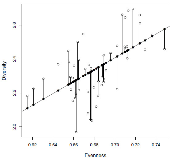
plot(evenness, diversity)This is an important step for any analysis as even by eye we can get a good idea of the nature of the data and whether there are any issues that have to be dealt with, such as outliers. In this case we can see that a linear model is appropriate as it appears there is likely to be at least a positive linear relationship between our two variables, in that they are increasing together.

Figure 4.1. Plot of diversity against evenness (SQS) from the extrinsic dataset (open circles) along with a fitted least squares regression line. The fitted values are shown as filled circles and the residuals by vertical lines.
Calculating a linear regression
In a linear regression this line is called a least squares regression line, that is the line that minimizes the sum of the squares of the residuals. Before I show you how to implement a linear regression in R I want to walk you through how the slope (m) and intercept (c) are calculated for a simple bivariate dataset. The first step to determining the equation for the least squares regression line is to calculate the slope (or gradient) of the line (m), for which we need to know two things: the sum of squares for y (SSX), which is the sum of the difference between the observed values, and the mean value of x squared. So the equation for SSX is as follows:
(4.1)
\[SSX = \sum{(\text{observed value of }x - \text{mean of }x)^2}\]
In R we can calculate this using the following code and store it in the new variable called ssx:
ssx <- sum((evenness - mean(evenness))^2)However, care must be taken when writing such functions: the placement of brackets is important, as this determines the order of operations. In this example we want to first calculate the difference between each and every evenness value and the mean of evenness, then square each of these values, then finally sum all of these numbers together – not to calculate the squared value of the sum of the differences. If you were to do this then you will get zero as an answer:
sum((evenness - mean(evenness)))^2
[1] 0
Next we need to calculate the sum of products (SSXY) that is represented by equation 2 below.
(4.2)
\[SSXY = \sum{(\text{observed value of } y - \text{mean value of } y)} \times (\text{observed value of } x - \text{mean of } x)\]
In R we can calculate it as follows and store the value in the variable ssxy:
ssxy <- sum((diversity - mean(diversity)) * (evenness - mean(evenness)))So now we have both SSX and SSXY we can calculate of the slope (m), which is simply the sum of products (SSXY) divided by the sum of squares of x (SSX) (equation 4.3).
(4.3)
\[\text{slope} (m) = SSXY / SSX\]
We can store this ratio as the variable slope:
slope <- ssxy / ssxIf we now call for slope we will get the following result:
[1] 3.511038This confirms what we saw by plotting the data, that there is a positive slope between our two variables of interest and that as the evenness value increases, so does diversity. Now we have the slope of the best fit line we need to calculate the value for the intercept (c) which is calculated using the following formula (equation 4.4):
(4.4)
\[\text{intercept} (c) = \text{mean of } y - (\text{slope} \times \text{mean of } x)\]
And in R we can calculate the value and store it in the variable intercept:
intercept <- mean(diversity) - (slope * mean(evenness))Now if we call for intercept we will get the value:
[1] -0.05080294So finally we have both of the values we need, the slope of the line and the intercept, so we can add this regression line onto our original plot (Figure 4.1) using the function abline, where the arguments a and b represent the intercept and slope respectively (see help(abline) for more details):
plot(evenness, diversity)
abline(a=intercept,b=slope)
It stands to reason that you don’t need to go through all of these steps to calculate a linear regression and that there is an inbuilt function for this method. In R the function you need is called lm, for linear model, the syntax for which is as follows:
(4.5)
lm(dependent variable ~ independent variable)
A quick note here that while in plots and correlations the independent variable (x-axis) typically comes before the dependent variable (y-axis), this is reversed for all model formulae within the R environment and the two variables are separated by a ‘tilde’ (~) which means “is modelled as a function of”. So to run a linear regression we can use the following code, storing the result in the variable lm.mod:
lm.mod <- lm(diversity ~ evenness)If we now call for lm.mod we will get the following output:
Call:
lm(formula = diversity ~ evenness)
Coefficients:
(Intercept) evenness
-0.0508 3.5110
This provides the formula that has been given (passed) as input to lm as well as the intercept and slope values respectively. You can see that these values match the ones that you previously calculated. Now you can add this line to your existing plot using the same function we used previously, abline; however, we can just specify the variable that contains the linear model rather than using the arguments a and b as before. Plotting this line with a different colour using col="red" you can see that it plots directly on top of the line you calculated manually:
abline(lm.mod,col="red")There is more information held in lm.mod than just the coefficients of the least squares line, and we can see the names of the elements of lm.mod by using either the functions names or ls:
ls(lm.mod)This will return the following:
[1] "coefficients" "residuals" "effects" "rank" "fitted.values"
[6] "assign" "qr" "df.residual" "xlevels" "call"
[11] "terms" "model"
Of this list I need to mention fitted.values and residuals. The fitted values, which can be called using lm.mod$fitted.values, represent the values for the dependent variable (y-axis) for the regression line. We can see these if we plot them against our independent variable (Figure 4.1) using the argument pch to draw them in a different way:
points(evenness, lm.mod$fitted.values, pch=19)Secondly, as you will see in Figure 4.1, the data do not lie perfectly on the regression line and there are deviations from the model (fitted.values). The differences between the fitted values and the original data points are called residual values as in:
lm.mod$residuals
You will see that you have a range of positive and negative values, as some of the data points lie above and some below the regression line. We can show the residuals graphically by joining them to the fitted values using the function segments, which is useful for adding lines to plots (Figure 4.1):
segments(evenness, lm.mod$fitted.values, evenness, diversity)Now just fitting a line to the data is not enough to prove that there is a relationship, as no matter what data you provide to lm it will provide a least squares regression line. So we also want to know how significant this model is from random data, and whether we can therefore reject the null hypothesis. The function summary can be used to show all of the information stored in lm.mod in a meaningful way:
summary(lm.mod)At the bottom of this you will see the ‘Multiple R squared’ and ‘Adjusted R squared’ values; these tell you how well your model fits the data. Below this is the test statistic (F-statistic) and the associated ‘p-value’ that tells you how significant the model is. In this case, with a p-value of <0.001, we can reject the null hypothesis that there is no relationship between our two variables; however, the adjusted R-squared value is 0.3078 which tells us that our independent variable (diversity) is only explaining around 31% of the variation of our dependent variable (evenness).
Checking the model
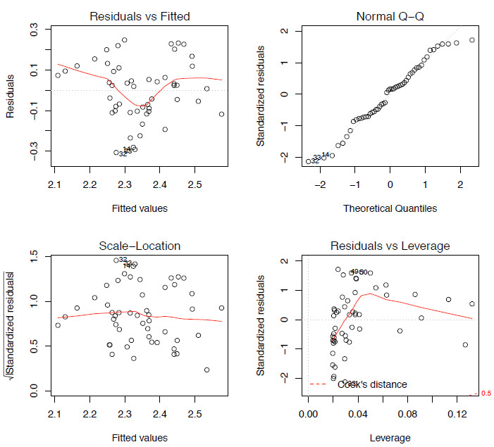
So we are now at a stage where we have fitted one model to our dataset. However, we are not yet ready to move on and either declare the job finished or try another model for comparison. Next we have to ask a few questions: does the model correctly describe the data and does this agree with the assumptions of a linear regression I discussed earlier, specifically statements [iii] to [v] above? There are three different plots that are useful in showing how well our model is doing and we can show these by simply plotting lm.mod, resulting in four different plots being shown:
par(mfrow=c(2,2)) # Allows for four plots to be included in one window
plot(lm.mod)
The first assumption we need to test is that the residuals show a normal distribution. We can plot the distribution of the residual values as a q-q plot (see Article 3) (Figure 4.2 top right). Additionally we could plot these values as a histogram or use a Shapiro-Wilk test to test the null hypothesis that the distribution is taken from a normal distribution.
hist(lm.mod$residuals)
shapiro.test(lm.mod$residuals)
Using any of these methods we can see that here the residuals display a normal distribution so at the moment there are no issues that we need to worry about.

Figure 2. The four model-checking plots for lm.mod.
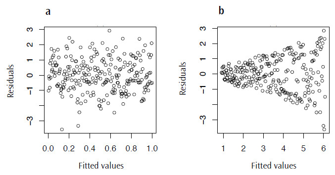
plot(lm.mod$fitted.values, lm.mod$residuals)There are a couple of things we are looking out for here; firstly we want to see something like Figure 4.3a, a distribution lacking in any patterns or trends, as this may suggest that the model we have chosen is not the most appropriate. More concerning though, is that we really don’t want a case where the variance increases as the fitted values also increase; this will result in the distinctive fan shape in this plot (Figure 4.3b), a pattern with the great name of heteroscedasticity.
Finally, we don’t want any outliers in the data as these can have a large influence, or leverage, on the model. The bottom right plot of Figure 4.2 shows a plot of the leverage of each point against the standardized residuals; what we don’t want to see are any points lying outside the Cook’s distance line (marked as a dashed red line). In this case, none of the points are outside of the Cook’s line so there are not any points with a high leverage on the model. With all of these comparisons completed for this dataset, none of the assumptions of a linear regression have been violated, so we can say that this is an appropriate model for comparing these two variables.

Figure 3. Plots of the residual values against the fitted values for lm.mod: a) a typical plot with no visible trend and b) an example of residuals displaying heteroscedasticity.
Fitting linear models to non-linear data
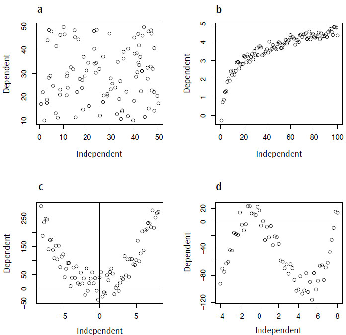
One of the commonest errors in statistical modelling is applying an inappropriate model to your data. As I mentioned at the beginning, in the case of a linear regression one of the assumptions is that there is a linear trend between the dependent and independent variables. This is where visualizing your data is very important, as even if all of your data fit the assumption of being normally distributed there may be a nonlinear component to the data that should be accounted for. Figure 4 shows a range of nonlinear trends that could occur in your data, ranging from a complete absence of any relationship (Figure 4.4a) to data described by logarithmic, quadratic or cubic functions (Figures 4.4 b-d).

Figure 4. Examples of non-linear data for which fitting a linear model would be inappropriate: a) random data, no trend; b) logarithmic data; c) quadratic data; d) cubic data.
Summary
As I mentioned at the outset this is an incredibly diverse and complex subject and, while I won’t be able to cover every kind of modelling technique in this and the following articles, my intention here is to provide an insight into the range of techniques available and how to apply them in the R environment. Here, I have covered one example of a technique for a continuous independent variable, the linear regression. In the following article(s) on statistical modelling I intend to cover a technique used when your independent variable is categorical (ANOVA) as well as other nonlinear regression techniques, and variations on these such as generalised linearn models (GLMs).
In addition, I hope that I have shown here that these are not complex tests to perform, requiring only a few lines of code in each case. In my experience, one of the most annoying and fiddly stages to any analysis is getting the data into the correct format so that they can be either read by R (especially as error warnings in R are not often that enlightening) or inputted into the function(s) you want to use. Trust me, once you have passed this stage life becomes a lot easier.
