3. Statistical Tests I – Comparisons and correlations
In the two previous introductory articles in this series my aim was to introduce you to the basics of the R language and to cover some of the essentials for any analysis, i.e. loops and functions. I appreciate that getting used to how to process data using these methods, especially those in the previous article, can take a while to get your head round. As such I don’t want to scare anyone away who may be keen to develop their analytical skills and may wish simply to perform basic statistical tests on their own data, in the first instance at least. So in the next couple of articles I will focus on the basics of statistical analysis in R; all the code for these analyses will be simple and not involve the need to understand loops fully at this stage.
R is capable of performing all of the commonly-used statistical tests (many with a single command) without the need to write any additional code or install any other packages. Many if not all of the tests I will discuss here are located in the stats package that was automatically included when you installed R. To see a full list of the functions contained in this package type help(stats) then click on ‘Index’ at the very bottom of the page.
In this article I will introduce some of the most commonly used statistical tests, explaining when it’s best to use them and how to implement them in R. All the examples I have provided here use the same datasets from the last two articles which are available at the PalAss website (see below), along with details on how to load these files into the R environment.
| File Name | Size | Download |
|---|---|---|
| asaphidae.txt | 198kb |
Before I begin I briefly want to mention a previous Newsletter contributor; Norman MacLeod’s PaleoMath series (available at <http://www.palass.org/modules.php?name=palaeo_math>) covers a wide range of palaeontological analytical techniques such as regression and multivariate analyses, e.g. Principal Components Analysis (PCA). While I intend to demonstrate how some of these methods can be carried out in R the PalaeoMath series is an excellent resource for those interested in the theory and usage of these analyses and is also written with the novice in mind.
Null hypotheses and p-values
While there are many different statistical tests that can be used to examine every facet of your data they all have one aim in common, to significantly differentiate any pattern in your data from one that could be caused by random variation: that is, is your observed pattern likely to have a cause beyond chance alone? This is referred to as a null hypothesis, usually denoted as H0 which in simple terms says that there is no pattern in your data. If we had two samples labelled A and B that represented potentially two different species, and we wanted to know if they differed significantly from one another, the null hypothesis could be written as follows:
H0 = sample A is not significantly different to sample B
So our aim is to reject the null hypothesis in favour of an alternative hypothesis (H1) that might be:
H1 = sample A is significantly different to sample B
In many tests the distinction between these two hypotheses is made using a p-value that is returned in most statistical tests. Fundamentally the p-value represents the probability that null hypothesis is true. Typically, the value of 0.05 is used as an arbitrary cut-off (a critical value or alpha, α) that means that the null hypothesis has only a 5% chance of being true. So if we were to use a statistical test to compare samples A and B and that test returned a p-value of 0.01 we could say that the null hypothesis has a 1% chance of being true and therefore we can reject it in favour of H1 and say that the samples are significantly different.
The normal distribution and calculating variance
The normal (also called a Gaussian) distribution is one of the most commonly used distributions in all of statistics and whether your data fit this distribution or not can influence which test you select for your analysis. The shape of the normal distribution is described by two things: the mean (the average value of the sample) and standard deviation (the amount of spread of the data). The standard deviation (σ or SD) represents a measure of the variance around the mean of a sample. In a normal distribution 95% of all data points lie within ±1.96 standard deviations (SD) of the mean (Figure 3.1).
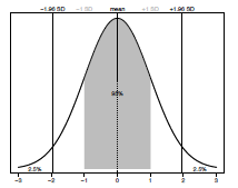
Figure 2.1. The normal (Gaussian) distribution. The mean value is shown by a dashed line. A grey box represents all data ± 1SD. Plotted percentage values indicate how much of the sample is within and outside ± 1.96 SD respectively.
Standard deviation is defined as the square root of the variance for that sample. In order to calculate that we first need to know the sum of squares which is the sum (∑) of the squared difference between each observation and the mean (equation 1 below). Knowing this we can then calculate the variance by dividing the sum of squares by the degrees of freedom (the number of observations minus one) (equation 2 below). Finally we can take the square root (√) of the variance to provide us with the standard deviation of our sample (equation 3 below).
(1) Sum of squares = ∑(observation - mean)2
(2) Variance = sum of squares / n-1
(3) Standard deviation (SD) = √ Variance
Data types and statistical tests
The data commonly included in statistical analyses can be broadly categorized as either qualitative or quantitative. Qualitative or categorical data describes data consisting of a number of groups or categories such as taxonomic groups or size classes (e.g. ‘large’ and ‘small’). Quantitative data can be further separated into continuous and discrete data. In continuous data the values can be any number, such as measurements of length or temperature, and include fractional elements (e.g. 3.14), whereas in discrete data not all values are possible and usually
consist of integers (e.g. number of individuals).
Broadly speaking statistical tests can be categorized in a number of ways depending on what they do and the assumptions they make. Here I will briefly discuss two distinctions: descriptive versus inferential, and parametric versus non-parametric tests. Descriptive statistics are used when you want to summarize or show the data in a way to highlight some property of the data, such as the average of all the data (e.g. calculating the mean) or how the data are distributed (e.g. standard deviation). Whereas, inferential statistics are used when we want to analyse a sample of data in order to infer patterns about a larger population, or to test hypotheses regarding one or more samples. An example of inferential statistics would be in using a statistical test to examine the previously discussed null hypothesis (H0) that Sample A is not significantly different from Sample B.
The distinction between parametric and non-parametric tests is determined by the type of data they are designed to handle. In the former it is assumed that the data follow a specific distribution, whereas the opposite is true for non-parametric tests should the data be nonnormal. It is common that parametric tests have their non-parametric equivalent (for example the Mann-Whitney U test is the non-parametric version of the t-test).
Descriptive statistics
After a period of data collection you will have either one or multiple samples that you will want to ask some questions about, such as what is the mean of these samples? Or do they display a normal distribution? In order to demonstrate the functions that allow you to examine your samples we will use the ‘Asaphidae body-size’ dataset. Starting with the first question: let’s say you want to ask what is the mean body-size of the genus Asaphus. You can use the function mean that only requires an array of values:
mean(asaphidae[,"Asaphus"],na.rm=TRUE)
[1] 19.22518
However, the option na.rm=TRUE is required here as mean won’t return a value if any of the elements are missing (NA) – which you can see is the case if you examine asaphidae[,"Asaphus"] in detail. To make things a little easier to follow I will assign all the non-missing values to their own variable called asaphus. Remembering the convention of exploring matrices as [row, column], below I ask for all entries in the column “Asaphus" but use the function is.na to get only the values in that column that do not have any missing values: i.e. when is.na (are any of the values NA) is equal to FALSE:
asaphus <- asaphidae[is.na(asaphidae[,"Asaphus"]) == FALSE, "Asaphus"]Now we can ask what the mean is of the Asaphus sample by using:
mean(asaphus)… which will return the same value as previously:
[1] 19.22519We can also ask for the median value by typing:
median(asaphus)… which will return:
[1] 18.15In addition, if you wanted to know the minimum, maximum and 1st quantile values you could use min(asaphus), max(asaphus) and quantile(asaphus,0.25) respectively, though in fact all this information can be gained from the function summary which returns all these values together:
summary(asaphus)
Min.   1st Qu.   Median   Mean   3rd Qu.   Max.
3.30   14.86     18.15    19.23  21.77     166.00
Finally, as discussed at the start a common measure of the spread of the distribution is the standard deviation (SD). This can be easily calculated using the function sd, as in the following:
sd(asaphus)
[1] 13.26326
So the standard deviation (± 1SD) from the mean of Asaphus is roughly 13; the values for ± 1SD are retrieved by the following commands:
mean(asaphus) + sd(asaphus)
[1] 32.48844
mean(asaphus) - sd(asaphus)
[1] 5.961929
Testing for a normal distribution
A common visual way to test for the normality of a distribution is the quantile-quantile (Q-Q) plot that plots the ranked quantiles of your data against a distribution of theoretical quantiles taken from a normal distribution. A normal sample will show a straight line, while a non-normal distribution displays a deviation from a straight line, typically as an S-shape. We can see the difference between normal and non-normal data if we compare the Asaphus data with a randomlygenerated dataset of 1,000 values taken from a normal distribution using the function rnorm.
X <- rnorm(1000)To see the difference between the two distributions you plot them using hist(X) and hist(asaphus).
A Q-Q plot can then be generated for both the random and the Asaphus datasets using the code below. In Figure 3.2 you can see that the Asaphus data on the right do not show as straight a line as the randomly-generated data on the left. It should be noted that as X is generated randomly your plot will differ from Figure 2.
par(mfrow=c(1,2))
qqnorm(X)
qqline(X)
qqnorm(log(asaphus))
qqline(log(asaphus))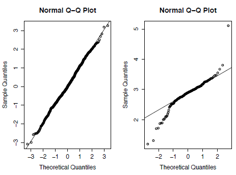
Figure 3.2. Quantile-Quantile (Q-Q) plots for randomly generated data taken from a normal distribution (left) and for the trilobite genus Asaphus (right).
A formal test for normality is to use the Shapiro-Wilk test using the null hypothesis (H0) that the data are normally distributed. The function for this is shapiro.test as follows:
shapiro.test(X)
shapiro.test(asaphus)
This will return the test statistic (W) in each case and the associated p-value. The results of this test mirror those of the Q-Q plots where the p-value for X (0.1818) is above the critical value of 0.05 and therefore H0 cannot be rejected. On the other hand asaphus has a p-value lower than 0.05 which allows us to reject H0 and show that the distribution is significantly different from normal.
Two sample comparisons
More commonly, rather than examining one sample in detail, you will want to compare two or more samples to determine whether they are significantly different. I discuss a number of commonly-used classical tests below. For this we will need another couple of samples with which to compare. We will now include the measurements from two other genera: Opsimasaphus and Neoasaphus:
neoasaphus <- asaphidae[is.na(asaphidae[,"Neoasaphus"]) == FALSE, "Neoasaphus"]
opsimasaphus <- asaphidae[is.na(asaphidae[,"Opsimasaphus"]) == FALSE, "Opsimasaphus"]
We can use boxplots to view and compare the distributions of these three genera (Figure 3). Here Figure 3 is plotted on a log scale using the option log="y".
boxplot(asaphus,opsimasaphus,neoasaphus,log="y",names=c("Asaphus","Opsimasaphus","Neoasaphus"),ylab="Length (mm)")[Figure 3. Box plots for the body-size of three trilobite genera plotted on log-scale.]
The first test I want to discuss is called the Student’s t-test and is used to compare the mean values between two samples of continuous data that have a normal distribution. The null hypothesis for the t-test is that both samples are drawn from populations with the same mean value. The function for the t-test is called t.test and can be implemented as follows:
t.test(asaphus,opsimasaphus)I should mention that you don’t need to separate the data into individual variables in this case as each of the tests discussed here will accept missing (NA) values and will return the exact same answer if you just select the columns you want to analyse:
t.test(asaphidae[,"Asaphus"],asaphidae[,"Opsimasaphus"])The t-test will return a lot of information looking like this:
data: asaphus and opsimasaphus
t = -4.7126, df = 72.871, p-value = 1.143e-05
alternative hypothesis: true difference in means is not equal to 0
95 percent confidence interval:
-31.62247 -12.82477
sample estimates:
19.22519 41.44881
The important information here is the test statistic (t) and the p-value which in this case is well below the critical value of 0.05, suggesting that we can reject the null hypothesis that the samples have equal means and conclude that the samples are significantly different.
In opposition to this we can examine whether Asaphus and Neoasaphus are statistically different using the same method:
t.test(asaphus,neoasaphus)In this case the null hypothesis cannot be rejected as the p-value, at 0.6093, is well above the critical value; this is also evident if we look at the distributions in Figure 3.3.
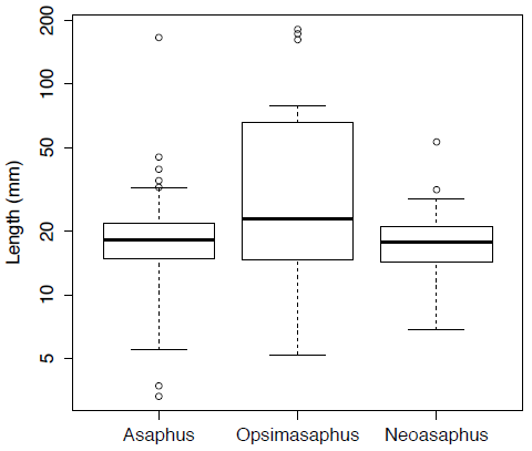
Figure 3.3
Now, I mentioned that an assumption of the t-test is that the data are normally distributed. A s we have already seen this is not true of the Asaphidae data provided here. Therefore, we should use the non-parametric version of this test which is called the Mann-Whitney U test (also known as the Wilcoxon rank-sum test). The function for this is called wilcox.test and can be run in the same way as for t.test:
wilcox.test(asaphus,opsimasaphus)This will also return the statistic (W) along with the associated p-value. The results of this test are similar to those of the t.test in that the p-value is less than 0.05, so the null hypothesis can again be rejected.
It is possible that while two samples may not differ in terms of their means, they may have a different shape in terms of distribution, varying in either the overall variance or amount of skewness. In order to test whether two samples vary in their distributions we can use the Kolmogorov-Smirnov test in which the null hypothesis is that both samples are drawn from the same distributions. The function for this is ks.test, and is similar to the Mann-Whitney U test in that it does not require the data to be normal:
ks.test(asaphus,opsimasaphus)
ks.test(asaphus,neoasaphus)
The results of this test are similar to those for other tests in that the p-value is lower than the critical value, allowing us to reject the null hypothesis in the first example but not for the second.
Linear correlations
Correlations are an important and commonly-used statistical test, used when you want to examine whether two sets of data show a statistical relationship. Many different types of correlation tests exist, but I will focus here upon linear correlations, which test whether the variables either increase or decrease together, and specifically the Pearson product-moment correlation coefficient (the default for the functions in R). In the case of a perfect linear fit (either positively or negatively) all the data points would lie on a straight line when plotted against each other (Figure 3.4). For a correlation test two continuous variables containing the same number of values are required, although these can contain missing values which I will come on to later, such as:
x <- c(-3,-1,1,2)
y <- c(-2,-1,2,3)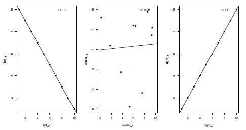
Figure 3.4. Plots of three kinds of correlation coefficients (r or R); a strong negative correlation (left), a weak positive correlation (centre) and a strong positive correlation (right).
Fundamentally, a linear correlation test operates in the same way as the two-sample tests, in that the null hypotheses (H0) is that there is no correlation between the two variables and the probability of this being true is represented by a p-value.
The Pearson product-moment correlation coefficient (typically written as r or R) is a measure of the linear correlation between the two variables. Values can range from -1 to +1, representing where end members demonstrate a perfect negative or positive correlation respectively, with 0 indicating no correlation (Figure 4). Pearson’s r is defined as the covariance of the variables divided by the product of their standard deviations (SD). For variables x and y this can be calculated as follows:
cov(x,y) / (sd(x) * sd(y))which will return the value:
[1] 0.9788389The function for calculating Pearson’s r is called cor and will return the same value:
cor(x,y)
[1] 0.9788389
If you want to calculate the significance of this correlation in order to reject or accept the null hypothesis the function to use is cor.test:
cor.test(x,y)
Pearson's product-moment correlation
data: x and y
t = 6.7648, df = 2, p-value = 0.02116
alternative hypothesis: true correlation is not equal to 0
95 percent confidence interval:
0.2996062 0.9995757
sample estimates:
cor
0.9788389
As shown above this will return a set of values similar to the previous two-sample tests that contain the test statistic (t), degrees of freedom (df), p-value and the correlation coefficient value (r, marked as cor). We previously knew that there was a strong positive correlation between these two variables as the correlation coefficient is close to 1, but we also know that this correlation is significant as with a p-value of 0.02 it is less than the critical value of 0.05 so the null hypothesis can be rejected.
Another statistic that is commonly quoted along with the results of linear correlations is the r-squared value (r2 or R2), also known as the coefficient of determination. In the case of linear correlations this is typically calculated as the squared value of the correlation coefficient and represents how much of the variation of one variable is explained by the second. So in the case of x and y the r2 value can be calculated as follows:
0.9788389^2
[1] 0.9581259
This tells us that 95% of the variation in x can be explained by y.
Finally, we can use real data to examine the relationships using the extrinsic dataset available at <http://www.palass-pubs.org/newsletters/downloads/number85/extrinsic.txt>. This contains variables representing diversity, environmental parameters and rock area for the Phanerozoic taken from Mayhew et al. (2012).
If we wanted the correlation coefficients for all columns in the dataset we can again use the function cor, which will return the r values for every pair-wise combination of columns:
cor(extrinsic)However, if we wanted to examine the relationship between temperature and subsampled diversity (SQS) we can type the following:
cor.test(extrinsic[,"Temperature"], extrinsic[,"SQS"])
Pearson's product-moment correlation
data: extrinsic[, "Temperature"] and extrinsic[, "SQS"]
t = -1.6848, df = 49, p-value = 0.09839
alternative hypothesis: true correlation is not equal to 0
95 percent confidence interval:
-0.47871608 0.04444625
sample estimates:
cor
-0.2340037
In this instance there is a weak negative correlation between these two variables as the r value is only -0.234 and the p-value is greater than 0.05 at 0.098, which means the null hypothesis cannot be rejected here. The lack of correlation between diversity and temperature in this case can be seen if we view the data graphically (Figure 3.5) using:
plot(extrinsic[,"Temperature"], extrinsic[,"SQS"], pch=19, xlab="Temperature",ylab="Diversity (SQS)")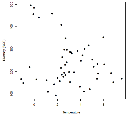
Figure 3.5. A simple plot showing an example of a weak correlation between temperature and diversity.
Now in order to calculate the r2 value we could simply type:
-0.2340037^2… which would give us:
[1] -0.05475773However, if we wanted to conduct multiple comparisons this would be very time-consuming; as such it would be useful to save the results of this analysis in a new variable, results, so any information you want can be easily extracted:
results <- cor.test(extrinsic[,"Temperature"], extrinsic[,"SQS"])To see all the names for the objects that are now contained in results we can use the ls function:
ls(results)
[1] "alternative" "conf.int" "data.name" "estimate" "method" "null.value" "p.value" "parameter" "statistic"
So if we wanted to see just the p-value or the correlation coefficient (contained within "estimate") we can type:
results$p.value
[1] 0.09838648
results$estimate
[1] -0.2340037
Then to calculate the r2 value we can use the following:
results$estimate^2
[1] -0.05475773
Finally, along with a Pearson’s correlation (the default for cor and cor.test) you can also implement a Spearman’s rank correlation or Kendall’s tau correlation using the method argument and the options "spearman" and "kendall" respectively:
cor.test(extrinsic[,"Temperature"], extrinsic[,"SQS"], method="spearman")
cor.test(extrinsic[,"Temperature"], extrinsic[,"SQS"], method="kendall")
Missing values
I mentioned briefly about the presence of missing (NA) values in your data. When running cor.test for the correlations this does not make a difference as any pairs of data that contain missing values are removed prior to the analysis, as you can see if we add in a new value to x and a missing value to y.
x2 <- c(-3,-1,1,2,5)
y2 <- c(-2,-1,2,3,NA)
cor.test(x,y)$estimate
[1] 0.9788389
cor.test(x2,y2)$estimate
[1] 0.9788389
However this is not the case when using cor, which will return a NA if either of the values contain missing elements; try comparing cor(x,y) with cor(x2,y2) and you will see that the latter will not return a value. In order to get around this the argument use is required, which with the options "complete.obs" or "na.or.complete" will only include the pairs of observations which both contain values:
cor(x2,y2,use="complete.obs")Now if you go back and try cor(extrinsic) you will see there are many comparisons that do not return a value; however if you run cor(extrinsic, use="complete.obs") those entries will now contain a correlation coefficient.
| Test | R command | Null hypothesis (H0) |
|---|---|---|
| Shapiro-Wilk |
| The sample is taken from a population with a normal distribution |
| Student’s t-test |
| The samples are taken from populations with equal means |
| Fisher’s F test |
| The samples are taken from populations with equal variances |
| Kolmogorov-Smirnov |
| The samples are taken from populations with equal distributions |
| Mann-Whitney’s U |
| The samples are taken from populations with equal median values |
| Linear correlation |
| There is no correlation between the two variables. |
Some final cautions regarding correlations
While implementing linear correlations in R is a simple matter there are a few cautions I feel I should point out. Firstly, the examples I’ve used here involving the extrinsic dataset are merely here to illustrate how to perform correlations, not necessarily as the most appropriate approach for this kind of data. This example typically falls into the category of time-series analyses which itself has a range of different techniques associated with the processing of the data (such as the removal of long-term trends by detrending) before undertaking any one of a number of different statistical tests. For the time being I will leave the basics of time-series analyses for a later article.
The second point to be made is that as in the last example the lack of a correlation doesn’t mean that there is no relationship at all between your variables, just that there is no linear trend – but there may be a non-linear (e.g. quadratic) trend. The final point to make here concerns the old adage of “correlation does not imply causation”, which emphasizes the point that if you find a significant correlation this does not suggest that changes in one variable have directly caused changes in the second. It is possible that both are independently controlled by a third variable or a combination of multiple variables. Also known as the third variable problem, this has implications in all branches of scientific inquiry. An example of this in current palaeontological research is the common-cause hypothesis (Peters and Foote, 2001) that suggests that while the observed diversity seen in the fossil record and the amount of sampling used to gather that information are positively correlated they may be both, independently, controlled by a third factor such as long-term fluctuations in sea-level. Therefore, while a highly significant correlation may not imply causation it may provide areas for further investigation.
Summary
This article is intended as an introduction to conducting statistical analyses in R and the interpretation of the results of these tests. In the next issue I will continue with statistical tests, focusing also on modelling through regressions.
REFERENCES
Mayhew , P. J., Bell , M. A., Benton , T. G., and McGowan , A. J., 2012, Biodiversity tracks temperature over time, Proceedings of the National Academy of Sciences, 109(38), p.15141–15145.
PETERS, S. E. and FOOTE, M., 2001, Biodiversity in the Phanerozoic: a reinterpretation. Paleobiology, 27, p.583–601.
FURTHER READING
Crawley , M. J., 2005, Statistics: an introduction using R, John Wiley and Sons, 342pp.
DYTHAM, C., 2010, Choosing and using statistics: A biologists guide, Wiley-Blackwell, 320pp.
HAMMER, Ø. and HARPER, D. A. T., 2006, Paleontological data analysis, Blackwell Publishing, 368pp
